Some of my favourite images so far...
These are my favourite photographs that I have taken since September 2022. Although they may not all have a recurring theme, I just stop and photograph something when I have the urge too. Some of these may be planned, others may be not, but all that is important in the long run is that I am creating work that I am proud of.


Photobook analysis - Pictures from Home by Larry Sultan:


This book centres around a son, who returns home to his parents as an adult. Larry Sultan takes pictures of the couple's unique furniture and decoration, capturing rooms that are covered in green from foot to toe, as well as the unique wallpaper that seems to be a staple in their home. He not only captures their interior design choices however, but also their dynamic as a pair, photographing them in positions that appear to be posed, while also snapping wholesome images of their everyday life. Although the list does not end there, as Sultan goes as far as reaching into his family archives, revealing shots that have been long forgotten, and bringing them back to life through the photography book I am presenting. Finally, there are also a few rare solo shots of the parents, some quite daunting and mysterious, and others casual and unplanned. To summarise this critically acclaimed book, I would state that it centres around a man returning home, capturing distant family moments through archives, and exploring his parent's connection, while occasionally expanding his horizons to solo portraits.
In terms of the cover of 'Pictures from Home', the image is of his father, seemingly greeting his son who is either arriving, or alternatively leaving his family home. The image seems to be strategically placed, both the tree, ladder, and even bush of pink flowers, framing the dad, so he is the epicentre of the image. When it comes to the title, the bright red Sultan carefully picked out doesn't seem to match the photograph, potentially suggesting that the colour was chosen in the means of standing out, instead of being aesthetically pleasing.
Throughout this set of photos, the unusual decor is what jumps out to me in the largest sense, the perfectly cluttered rooms, filled with plants and knick knacks, paired with the fake grass that is strategically placed on the floor in a single room, stands out to us as the audience. It is alternative from what is considered 'normal' in the decoration business, their outlandish personalities are reflected through the madness of their home. Sultan states that his intention for photographing his father was to confront his confusion about what it is to be a man in the culture at the time, being the years in which the image of family, along with the institution, were used as a symbol of inspiration by conservatives. Ultimately, Sultan disagreed with this belief, and wanted to puncture that myth around family, demonstrating what happens when we are driven by images of success. When looking through this book, there is not an artistic vision that comes to mind, as from my personal viewpoint the photographer's vision stems from his dream of capturing his family's dynamic, instead of focusing on the aesthetics of it all. Although his photos are definitely pleasing to the eyes, I think Sultan was more interested in his photos speaking to his audience, instead of creating them to be state of the art images. In terms of the style of photography that Sultan uses, he doesn't stick to one particular technique, as he rephotographs old family photos, includes photos from family archives, captures still life portraits, and more commonly takes images of his parents. Despite his work coming in all different forms, Sultan manages to still present his work as aesthetically sophisticated, instead of the suspected results of it being all over the place.
When flicking through this book, something you may notice is that the layout of the images are extremely diverse. Some are placed regularly, filling one side of the page, others filling up two pages, presenting this images as one Sultan wants his audience to pay extra attention too. Images that Sultan didn't capture are presented in groups, potentially suggesting that he doesn't want to take any credit for them. 'Pictures from Home' is filled with text, although I tried not to photograph these pages as I wanted to picture his actual work, it was difficult to avoid it altogether, as generally where there is a image, there is a story, or alternatively an explanation behind it. Despite the period that these photos were taken, I was surprised to realise that from my point of view, the layout doesn't appear to be dated, or on the contrary, overly designed. The design of the pages are simple and classic, encouraging the audience to pay more attention to the actual images, instead of the overcomplicated formation distracting from the photos themselves.
Although I have had a limited time to explore this book, after swiftly examining it, the abstract decor choices are what stick in my mind, along with the concept that all of our parents are going to get old someday. I believe that this is the lasting power that these images hold, as I think it's an important book to explore around the age that I am now. It has the power of making the images appear personal to you, encouraging a young audience to not only remember what they have seen, but also to open the book up again. Penultimately, I am a fan of this book, and believe that Sultan has done a great job of constructing the images into a sequence that really speaks to the reader. However, if I was to change something, personally, I would reduce the amount of text that 'Pictures from Home' holds, as at least for me, it encourages a lost of interest.
'I love making pictures, even if the results are lousy.'
Photos I am planning to take:
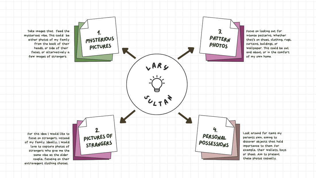
For my first suggestion, I am planning to incorporate newspapers into the mix, as there is a double sided page in 'Pictured from Home' filled with a page from a newspaper. Although I know that you shouldn't copy these images, and just copy their general vibe. However, this project is centred all around family, as this is what makes it personal, and my dad is in the journalist industry, so i aim to include this in a least one of my images. Additionally, for my second idea, I plan to capture my parents bedside tables, and my mum's dressing table, as throughout the description of one of Sultan's photos, he states that he photographed his father's bedside table. I also plan to play with the idea of light, as one of my favourite images from this book is the one of the mother opening the curtain, exposing the room to the slightest bit of brightness. I might experiment with this is different rooms, creating multiple images that play with this idea of light vs darkness. Finally, for my penultimate idea I want to take less inspiration from the actual ideas in the book, and more so take incentive from the vibe that the images give me. Therefore, I am going to centre a section of photos in my brother's room, as the books main intention is to capture his parent's life when he is returning to home, and I am going to capture my families life when my brother has left home. These two ideas, although oppositional, are directly linked.
The Photographers' Gallery:


While visiting the Photographers' Gallery, there was the Deutsche Borse Photography Foundation Prize 2023 going on. This is when four international photographers were selected for an outstanding body of work exhibited or published in Europe during the previous twelve months. All nominated artists are acknowledged for their major achievements and innovation in the field of photography and contemporary culture. The artists that were shortlisted in the year of 2023 are as follows: Bleke Deporter, Samuel Fosso, Arthur Jafa and Frida Orupabo. The winner of the £30.000 prize will be announced on the 11th of May 2023.
One of these artists is Fida Orupabo, who is nominated for her exhibition 'I have seen a million pictures of me face and still I have no idea at Fotomuseum Winterthur, Switzerland. She creates photographic collages that take the shape of fragmented, Black, mostly female-bodied figures. Her work is grounded in questions of race, gender and sexuality. It is attentive to representing the ambivalence and complexities often ignored in representations of Black experience. Orupabo's source materials from digitised colonial archives,
Another one of these artists is Bieke Depoorter, who is nominated for her exhibition 'A Chance Encounter' at Berlin C/O Berlin, Germany. She questions the role of responsibilities of the photographer and the possibility of truth in representation. Her work occupies an ethical and critical position that grapples with personal and professional boundaries. Agata Kay is a young Polish women who met Depoorter in a Persian strip club in 2017. Together, they explore questions of identity, performance, and representation, through their lively photographs and dialogue. However, the balance of self-reflexive examination and their shifting power dynamic is now broken, Kay stating she is unsatisfied and wants the project erased, and Depoorter who has suspended the publication of images, along with Agata's writing, until a solution is reached. The absence has become part of the project.
My first response:


For my first response, I used it as a kind of trial run, testing the waters on what photos are the most effective. However, while doing it, I was reasonably clueless, as although I have looked through and researched the book, I have never attempted to take any photos to match the general vibe of it. I attempted to use components that the book presented to me, like the pictures of the bedside table that Sultan took for his father, the mad patterns that are featured on their wallpaper and the mysterious way in which Sultan presents his dad. Saying all this, I am not completely happy with my final set of images, as I don't have the complete amount, although I like the ones I captured of my dad in the house, the tarot card reading in the shop, and finally the image of my nana's room. When looking back on what I have created, I decided to construct a mind map, to make the ideas more clear in my mind, and to make a plan for my future self, so my next set of photos doesn't feel all over the place, and I see a personal improvement.
Kidbrooke dérive:


To take these photos, we visited the area of Kidbrooke that is placed around `Thomas Tallis, instructed to take images of anything that we see that stands out to the eye. My photographs are something very different to what I have taken before, as usually I constantly play with colour, and have featured the majority of images inside. However, as my teachers seemed to like these images, I plan to take more that are like these, although that is difficult with the book that I have been told to focus on right now. Due to this, I do feel out of my comfort zone, despite the fact that I tend to take photos in my daily life, of random things that stand out to me, but they never match my project so I never really include them. While walking around, I was forced to really look at everything, and focus on items that I pass everyday, but never really notice. The images that were my favourite, and that I found successful, were the photos of the tree trunks, as I think the two circles on the ground give a cool effect. However, I don't enjoy the other one as much, but like the photo of the footprints engraved into the ground, and the flowers tied to the lampost. If I were to take this walk again, I would focus on the park to a greater extent, photographing the climbing frames, slides, and steps.
This project was based around psychogeography, which was invented by the Marxist theorist Guy Debord, in 1955. He was inspired by the French nineteenth century poet and writer, Charles Baudelaire, and his concept called an urban wanderer. Through this, Debord suggested playful and inventive ways of navigating the urban environment, in order to examine its architecture and spaces. Debord is known to have been the Situationist International movement, compiled with artists, writers and poets, aiming to break down the barriers between culture and everyday life. Therefore, Debord wanted a revolutionary approach to architecture, that was less functional and more open to exploration. Psychogeography gained popularity in the 1990s, when artists, writers, and filmmakers, began using the idea to create works based on exploring locations by walking. An example of this is Iain Sinclair, and Patrick Keiller.
Michael Mazzoni - Rien Presque


Mazzoni is a self taught artist, who came to do photography through cinema, as during the 60s and 70s there were a lot of independent films being made. During some point throughout this time, Mazzoni felt the need to begin taking photos, as this was his first experience of photography, although after time went on he exclaims that he didn't really feel like a photographer in the traditional sense, but more as a visual artist who uses photography as a medium in his work. Therefore this was how he became an independent artist, living in Brussels.
Rien Presque is described as an extension of Mazzoni's other works, such as 'Other things visible', as this time he went even further into his conceptual and minimalist research. The work throughout this book sends the audience back to the public space, as Mazzoni captures fragmented images, picturing the inherent aesthetics that surround them, both the ordinary and the minimalist structure. These images feature interlockings and artifacts, bringing together a set of fragmented views and motifs that relate to modernity when all put in a sequence. They are a representation of divisions in the urban landscape, functioning like small installations, generated by human actions. Some may consider them to be a sort of catalyst of poetic resistance, a state of things at a given moment, time capsules illuminating the current world.
This book was created in collaboration with the publisher MER.B&L, while the graphics were entrusted to the Luc Derycke studio. Mazzoni has worked with them twice prior to this, as he believes that they are a publisher who experiments with the possibilities of the artist's book, and who each time makes precise and unique proposals. He explains the interview process, stating that during their first he explains the direction he wants to go, exchanging ideas, and then letting the publisher move forward with the project. In terms of Rien Presque, it was necessary to give meaning to the reading by deciphering the dialect between the images, proceeding with a game of editing in order to create a connection between the forms. Through this, a set of combinations, correspondances and metamorphoses are opened, the graphic designer creating visible relationships between images that initially seemed contrasting. Mazzoni trusts the people he collaborates to such an extent that he touches very little on the structure on the book.
Blind Spot - Teju Cole:


Many of the photos featured in 'Blind Spot' originate from in Cole's previous books. When he began to travel on the account of his previously released photography, he used his images as an extension of his memory, now describing them to be tourist pictures. However, at the time he didn't see much value in these images, as it was only when he started pairing words with these images that they came to life. Cole stated that he was intrigued by the continuity of places, his images gradually forming patterns, he enjoyed the idea of his photographs all being connected in some way or another. Additionally, another crucial aspect to the book was Cole's religious past, being a strict evangelist in high school, to eventually losing his religion. He captured images that are at their most powerful when drawing on the apostate's longing, alongside quoted Bible passages.
From the very first page we are fed a snippet of Cole's intentions, his photos being clear cut interpretations of mental images. This book takes us on a journey, through five continents, almost 20 countries and more than sixty locations. Due to this, each page is a geographic surprise and a visual exhilaration, presenting the images first pre-verbally, at the time in which he feels is is crucial, followed by including them a second time, this version followed by text. The text we are fed changes the image completely, the choice of mutability brings enough force over the pages we turn that it becomes truly significant. Cole's images feature objects that are familiar, whether that is a sign on the wall in Brooklyn or fake gucci bags being outsold by migrants in Venice, they are all captured by a film camera, enhancing their rich colour. While fulfilling his role as a photographer, Cole has an eye for delicate juxtapositions, that are molded for the sake of photographic transformation.
- After becoming temporarily blinded in one eye as a photographer, his looking really changed, it became sacred.
- He began photographing things that were not exciting, but things that were washed with presence and light.
- Cole was really interested in finding out what conversations could be had between pictures and images, he is a photography critic, but did not want to talk in the same way of his own images.
- He was inspired to create writing based on the idea of a voiceover, something that engaged with the image, but in a way that was independent, you had the image, the text, and then a meeting of the two.
- Cole's interest in religious texts roots from that even in our postmodern age, we need language and the knowledge that it gives us, and you won't find that language in more concentrated forms, than in ancient texts.
- When travelling in the means of either photography or writing, your radar is up, both visually, anecdotally and narratively.
- Photography is a different kind of miracle, in that you can't go back and fix it, you have to take it in that moment, it emerges as a kind of collaboration with the world.
- We make work in the hopes that it will outdistance us, and tell us something we did not see, even while making it.
- If you have a picture of a room, you can think within the room, the human presence has a way of activating, and foreclosing opportunities, which is why Cole avoided portraits.
Images inspired by Teju Cole:


I took these images when going on a teacher's march, capturing the signs that stood out to me, wholesome interactions between strangers, the general atmosphere, or the aftermath. When walking around, I just took photos of objects or people that stood out to me, sorting out through the ones I believed were successful, or not. Additionally, I decided to edit these images into two sections, one being black and white and one of the original colour. Personally, I prefer photographs when they are without colour, however, the spirit of this march was mostly based in the colour of the flags, so I think it was important to at least keep some of this. Overall, I enjoy the split of these two type of photos, as it creates a differentiation between these and the others that I have taken. If I were to have another chance to take these images, I would take more, however after a while I believed that my photographs became to look repetitive, and therefore became more picky in the ones I kempt.
My second dérive:


These images were taking on an impromptu walk around Hither Green, in which I didn't plan to take photos but when walking around in noticed many photo opportunities. I aimed to capture images that surrounded destruction, stopping at what seemed to be abandoned houses to photograph the entrance, capturing the sign that was stuck on a garage door, a outside garden in the works, exposed wiring, one of many overflowing bins, and crochet flowers that stood outside a darling cafe and florist. However, I did not capture enough images, therefore my now plan is to go to greenwich and repeat this, taking another ten images that hopefully capture the same vibe. I will also most probably edit these to be black and white too, but time will tell. Overall, I like the images that I have taken, my favorites are the inside of the garage, the doorway to an abandoned house, and the box revealing exposed wire. My least favourites are the images of the broken down garden. I added to this set of photos while walking around Greenwich, capturing points of roughness in the sea of a middle class area.
A large portion of my images were taken in a car garage, somewhere I must have walked past a hundred times, but never really had a reason to enter. As I walked around I noticed the poor conditions of it, trash bags abandoned, graffiti everywhere you looked, peeling paint on every surface, Greenwich may appear up market but they only condition the places tourists encounter. From the few sets of photos I have taken over the last couple of weeks, I have realised that this what I like to do, go on walks to either places I have been and photograph locations I have already passed, or explore a new location and do the same. While photographing, I don't like to feel a certain pressure to photograph something specific, as I enjoy having the freedom of capturing anything that stands out to me, and turning an object that is not conventionally seen as an attractive photograph, into hopefully exactly that.
Florida's - Anastasia Samoylova and Walker Evans:


Samoylava's series Floridas is focused on documenting Florida, establishing a dialogue with Walker Evans, who documented the state between the 1930s and the 1970s. They both move between color and black and white, focusing on the details in landscapes, cityscapes, people, objects and interiors, all that speak volumes about the culture and social values. Her images are vivid, with sharp juxtapositions, she offers a test for endurance to the iconic American narratives of the American dream. In terms of Evans, he witnessed florida emerging in the 1930s, with it's blend of cultures, waves of tourism, stark beauty, and blatant vulgarity. He stuck with this until the 1970s, making polaroids that even know, still feel contemporary. Samoylova is known to have inherits what Evans saw coming, with intelligence and humour, she impressively picks her way through seductions and disappointments of a place that symbolises the contradictions of the United States today.
- Samoylova was fascinated by the ability that photography has to provide a record of time and place.
- She first became interested in Florida after taking a few road trips across the state.
- To her, Florida represented a concentrated version of America.
- Some areas of the state seem to be preserved in time, so they become sort of time capsules.
- Samoylova is in insider in Florida, as she has lived there for multiple years, and Evans is a visitor, and has been throughout the course of 40 years.
- The project was not meant to be a revisitation of Evan's sights, it's very much Samoylova's own perception.
- There are undeniable similarities in approach, both aesthetically and conceptually.
- The way in which their images are intertwined in this book is completely organic, it's a very playful approach, where you engage in a guessing game, the authorship is no longer relevant.
Meadowlark - Ian Bates


When Bates starting working on his photography book, he was just 24 and just out of photojournalism school. Although he was bought up in New Jersey, the young photographer travelled to South Dakota, often sleeping in a car throughout his years long road trip around the American midwest. As the seven years developed, the project became a combination of flooded farmhouses, sun dappled clearings, and smiling couples with upturned cars. This book is a meditation of the rugged geography, and the contradictions of a region that Bates says is often misunderstood by outsiders. He became famous through the faces of John Wayne and Clint Eastwood, through their work with films, over the last century. The landscapes featured are stark and barren, buildings lean, while people have false teeth and battered clothes. Bates suggest that people dream about the west from the movies they've seen, but it's not all flowers and sunshine, although it's really a harsh part of the country in terms of weather and hard living, Bates says, it's all farming, which can be a really difficult way to live.
Haze:
For this project we were told to capture a series of 36 images in the timescape of about 3 hours. We were allowed to go anywhere we desired, although we had to be back for a portion of time before the end of the day to present our images.


Reflecting on your work:
In the morning of our making day, I knew where I and a friend were going to go, as as instructed we had decided that beforehand. Additionally, I also knew what photos I had been enjoying taking for the past few weeks or so, and knowing how the photos on my derives were received, I thought it was a good idea to do this again. I like taking images of objects, buildings or areas that seem discarded, not looked after, or unusual, which is why I visited Peckham Rye, as it's run down and occupied look pairs well with black and white editing. However, after a while I felt my photos began to look repetitive, so I visited Blackheath, which although may appear to be upmarket, has some hidden spots of abandonment. In terms of the timing within this assignment, I found it to be very tiring, as after walking around so overly alert, I almost lost the ambition to take photographs that suited my project. Saying this, due to the importance of this project, I knew I had to ignore this, and after the day was over I was faced with the comforting feeling of accomplishment, which I don't usually feel when I take a fewer amount of photos.
I chose to first explore an area I have either never been, or have no memory of going, as I imagined this to be a lot more exciting, and less laborious. There were elements of this that I enjoyed, as the exploration of a place that you have never been, discovering the shops, streets, and people, made the simple idea of taking a sequence of images seem less dull. Although I didn't enjoy the consistant fear of getting lost, we did not go far, and I knew that soon I were to be in a place that I had been a million times over. In the end, I believe that going to Peckham Rye was a good idea, as I prefer the photos I took there, compared to the ones I captured in the heart of Blackheath. This is due to the many elements that are displayed in the images of Peckham, where it could just be a closed shop, or boxes throw onto the rain covered floor, it is not, as the stickers and graffiti that cover every inch of the area make them all the more interesting. My favourite images out of the bunch are the ones pictured in the fake gallery I edited in photoshop, on my 'Mock Day' page, these being the image of the shop shutter with a square cut into it, two abandoned shops covered in graffiti, a child's scooter on it's lonesome, a destroyed suitcase in an alleyway and a shot of destroyed wood in close proximity to a wall. These are the ones which I believe portray this sort of public neglect, although I feel my other images also encompass this, these are the ones that stand out to me personally.
In my mind, my online gallery although nothing overly technical, is quite effective, as the pops of colour from the borders gives the page a boost of colour, while the four images that follow stand out on the page. Additionally, the presentation, I believe, is a good way of displaying the images that although you may like, you don't want to overtly bring attention to, as it means all your images are on your page, but without appearing repetitive. However, the images that I put into photoshop are extremely blurry when you zoom in, which I am unsure whether this due to a fault of mine, or just what the application has done to my images. Next time, I may try to go into photoshop and overlap my images, as this is a way in which you can display two or more photos at the same time, in a different style. My current idea is to carry on with this theme of desertion, and with the editing style of black and white, perhaps setting myself up on more derives, preferably on places I have not yet visited, and capturing what stands out to me.
What next?
- Explore the limitations of Adobe Lightroom, find and try out filters that give the impression of film.
- Carry on to take images on the theme of abandonment, don't limit yourself to a overly specific theme, continue taking images of anything that catches your eye.
- Visit a new area, aim to take a minimum of 20 images that capture the heart of the place, for example, Spitifield.
My first holiday dérive:


These photos were taken when I unexpectedly visited Spitalfields, and even though it was my plan to just go there and have a fun day, while on the bus there I saw many photo opportunities, and this is when I made the decision to turn it into a little photoshoot. I began by walking back to where I had previously passed, photographing the walls and floor before walking on and capturing anything that stood out for the norm. My favourite images out of the 29 that I took in this specific place were the first, the seventh, the thirteenth, the sixteenth and the twenty ninth. Whereas, my least favourite images are the one of the diverted traffic sign and of the broom on the floor, as I think they appear rushed, and didn't play out the vision that I had in my head. In terms of the final seven images that I took in order to finish the series, I took these in Cornwall, both while strolling around an unknown town, and when visiting one of the many vintage shops that line the streets, in order to finish the series. In noting the ones that stand out to me, I would say the image of the lampshade and the old fashioned music player, and the image of the anchor like object, attached to a random brick wall.
My second holiday dérive:


Richard Learoyd:
- There are three rooms in the gallery, one for portraiture, one for landscapes and one for still life.
- Learoyd is driven to large views in which people are constantly photographing as he believes that they are the most relevant.
- He wanted to see is anything new could come from his interpretation, which does not create a pastiche of other people's work.
- The decision for him to actually partake in the act of taking the photo is a quick mental choice.
- When you create a picture of water you have to 'allow the gauche' in the words of Learoyd.
- He finds it harder to talk about the flowers than the landscapes as he doesn't think you could start off a display of work with flowers as he views them as a intermediate part in a photographic journey.
- Learoyd believes that photographing flowers is immortalising the process of decay.
- 'You can look at your life like your dying from the day you were born or or the opposite'.
- He states that the extended portrait is a vein running through a lot of contemporary photography.
- 'You can look at your life like you're dying from the day you were born or or the opposite'.
Austin Leong:


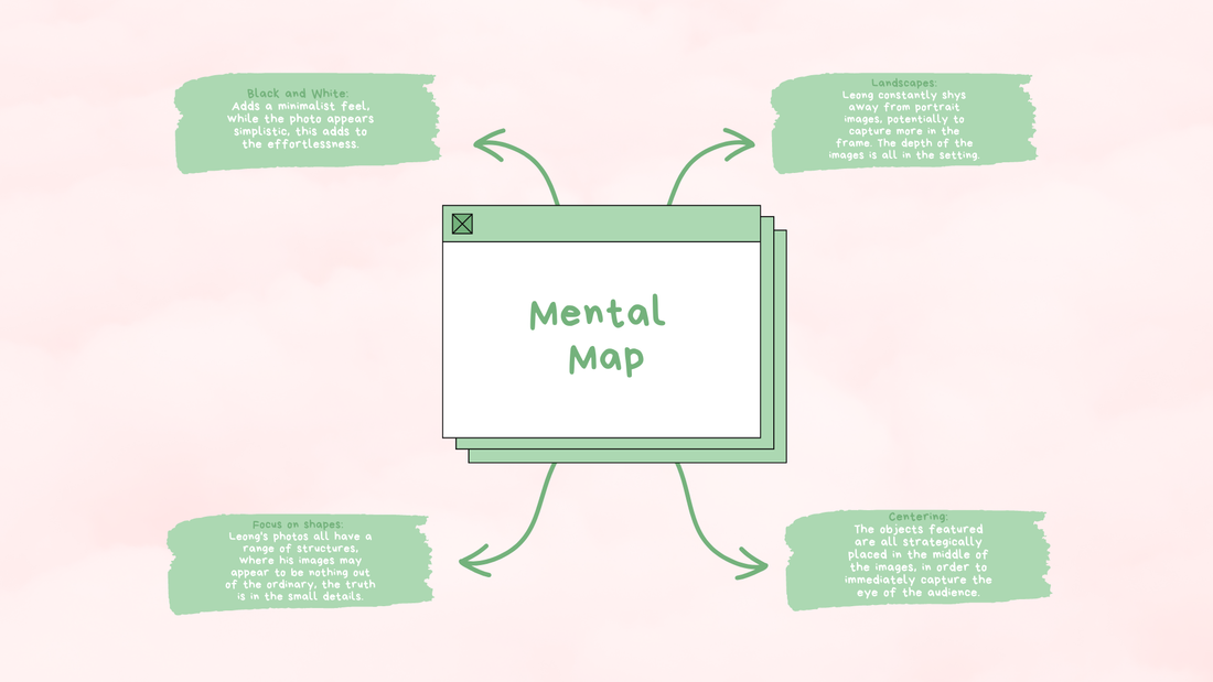
Leong grew up in Anaheim California, eventually relocating to his father's hometown of San Francisco. This is where he obtained a BA in Sociology from San Francisco State University, encouraging him to continue making images that explore relationships between individuals and the daily interactions acted out within their environment. Throughout his work, Leong has felt himself being drawn to capturing bizarre moments that are easily overlooked by the complex human mind, this being a recurring theme he is resistant to lean away from. As is clearly shown above, Leong primarily works in black and white, therefore he is known to spend hours in his darkroom practise, located in the Tenderloin neighbourhood of San Francisco. It was previously stated that Leong credits skateboarding as the community in which he began looking around at his surroundings, and where he passion for photography was sculpted. Since the early days, his photography has been included in numerous exhibitions, such as Looking Forward, Ten Years of Pier 24 photography. Along with his flourishing photography career, Leong also codirects a photographer run studio called Book and Job Gallery, and as actual gallery space.
Nowhere Diary interview - Austin Leong:
- Leong was given his father's old camera at age thirteen, which allowed him to understand the basics of a camera early on.
- His early years living in the city had a huge influence on his work.
- The two cameras he primarily shoots on are the Leica M6 and a Fuji GW690, as due to their aspect ratio, he feels free to use them in a fairly spontaneous way.
- When the weather is not amenable, Leong typically overexposes and under-develops his film by a stop of two, as he feels that this helps achieve a full range of tonal values.
- There's a constant energy that Leong looks for in his work, and that is the balance between humour and ambiguity, all at the same time as holding up an image that reflects the social experience.
Image analysis:

The image above is one of the few for Leong that includes no hints of human interaction, one that is simply of a sign many people would pay no attention too, graffiti being so common that it is now often overlooked by society. The juxtaposition of a sign that was supposed to bring hope and peace for passers by, to be transformed into a symbol of the idealisation of death is crucial, and it is a apparent snub towards religion. Additionally the clear cut line through the noun 'Jesus' highlights how the vandaliser didn't aim to completely erase the original aim of the poster, hinting at the possibility that this individual was focused on the political side of things, compared to the alternative suicidal human being. The fact that this image is a landscape suggests to the audience that Leong encourages us to look beyond the obvious, pleading for our perspectives to become more adventurous.
My response:


Tomas Cambas:


Tomas began experimenting with photography when he was only eighty years old, even then he particularly paid attention to cityscapes, feeling the need to share his perspective of the world. Through this, his choice in media became evident, his photographs showed him the way, instead of the other way round. Despite many considering Cambas himself a master, that didn't stop him from admiring others, especially Lee Friedlander, Cartier Bresson and Robert Frank, these people particularly being the individuals that unknowingly encouraged him into the dark room, beginning with analogue images in black and white, working steadily cropping and retouching. Through countless amounts of time, Cambas came to the realisation that his search in the world of photography was powered by geometry, taking reference from artists such as Laszlo Moholy Nagy, Alexander Rodchenko and Albert Renger Patzsch, he was able to find his own language. Due to this, he switched to a Rolleiflex camera, implying a new philosophy, and his photographs started to have another time, a turning point, the square shape took over changing format, along with a variety of other components. translating into a radical and satisfactory change.
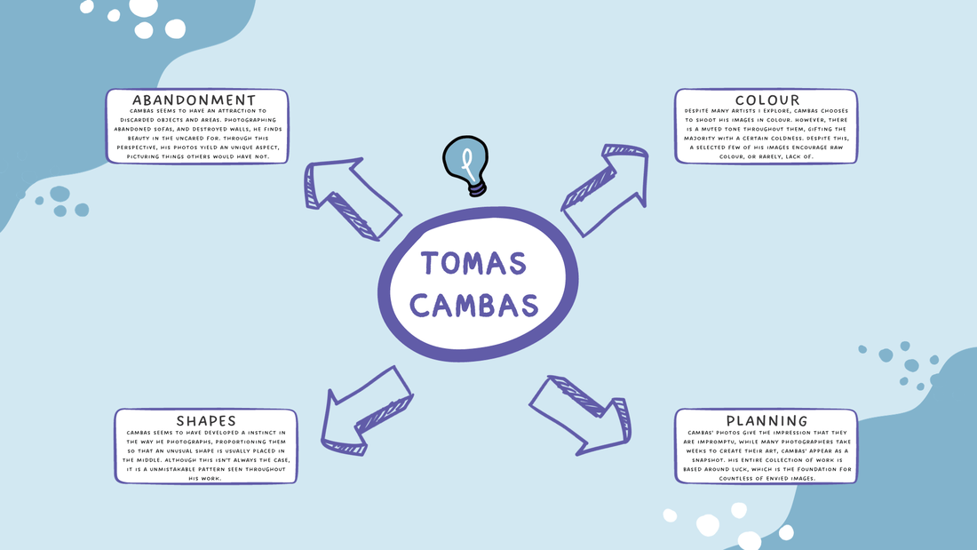
Image analysis:

The image above is one of the few that Cambas has that are simply of walls. His photos are simple, capturing the world in its natural form, without the restrictive constraints that social media has impeded on the seemingly 'perfect' photograph. Through the colours used, the impression of a morning sky is created, as the front and centre orange circle appears as an imitation of the sun, whereas the muted blue background contradicts the powerful hues of the orange. The floor is an embodiment of abandonment, displaying as if the front of a warzone, while the yellow lines and singular numbers hint to the basis of a parking lot. Along with all of these components, the black border is a huge disruption to the previously discussed aesthetic, along with the random lines that are perfectly painted, contradicting the ground below them.
Imaginary interview questions:
- What is the process for taking your images, are they planned or impromptu?
- Why do you choose to not to use the same hues on all of your images, why are some colour raw and others reduced?
- Many of your photos include bright colours, is this what draws you, or are there other alternative aspects?
- What areas are your favourite to capture, do you enjoy visiting desired locations or mistreated ones?
- Why have you not participated in any previous interviews, have they not been offered to you or do you not enjoy the limelight?
- Do you enjoy exploring photos similar to yours, or do you prefer researching a complete different take?
Albert Renger Patzsch:


Renger Patzsch was born in Wurzburg and began making photographs by age twelve, however this was not always his main focus, as he was part of the military service in the First World War, after studying chemistry. In the early 1920s, he worked as a press photographer for the Chicago Tribune before coming a freelancer, and eventually, in 1925 publishing a book. His first exhibition was in Lubeck in 1927, and shortly after a second book, in 1928, The World is Beautiful, which became his best known book, a collection of one hundred photographers, where natural forms, industrial subjects and mass produced objects. His work exemplifies the aesthetic of the New Objectivity that flourished in Germany during the Weimar Republic, Renger Patzsch believed that the value of photography was in its ability to reproduce the texture of reality, and to represent the essence of object. Among his works in 1920s are Eucheoeria, and Viper's Head, while during the 1930s he made photographs for industry and advertising, his archives being destroyed during the Second World War.
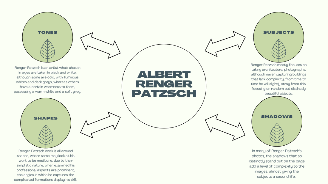
Image analysis:
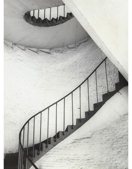
The image above is packed full of varying shapes, almost acting as a cut off for the image, as if the photo has three separate sections, the stairs, the diagonal shape of the wall, and the top of the winding staircase, acting similar to that of a ceiling. Additionally, the bright white paired with the dim grey, creates a dull image, evoking similar in an audience. The distinctness of the brick walls is a suggestion of age and decay, as what I assume is white paint is peeling, revealing a darker wall beneath, particularly closer to the top. There is not a single straight line throughout the photograph, enhancing it's disorder, and messiness, despite featuring such an idolised piece of architecture, one that is constantly referred to in idyllic fairytales. The rails that line the staircase allude to the constraints of a prison, so the as an audience are left with a direct parallel, one of a mythical story suggested by the winding staircase, and one of a nightmare, implied by the dark metal bars.
Imaginary interview questions:
- What was your main photographic interest throughout your prime time?
- There are many shadows throughout your images, what time of day was your favourite to capture?
- Many artists have said that you are one of their biggest inspirations, who was that for you?
- What interests you in terms of architecture?
- Did you photograph alone or under the instruction of others, either professionally or
